Wednesday Is the New Monday
5 min read
Wednesday Is the New Monday
Because if you don’t treat Wednesday like Monday, it will already be Friday.
LISETTE
SHARE
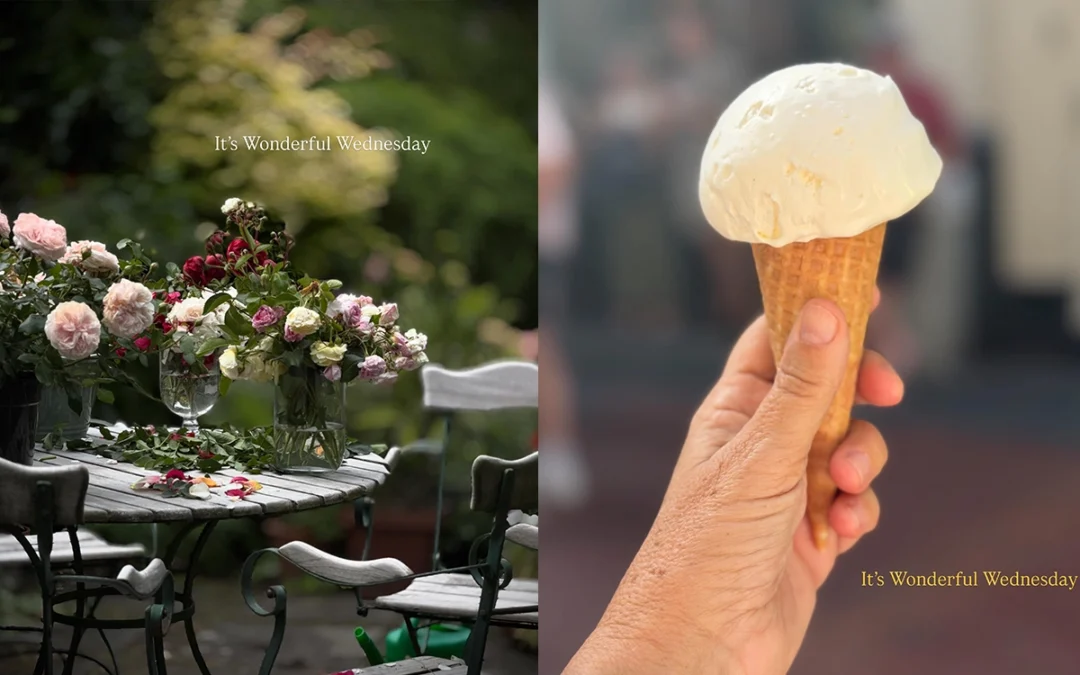
![]()
Wednesday has become one of my favourite days of the week. It sits quietly in the middle, almost unnoticed. Monday arrives full of ambition and good intentions, Tuesday flies by, and before you know it, you’re already halfway through the week. At that point, you have a choice. You can simply coast towards Friday, or you can stop, reset and begin again.
That is why I believe Wednesday is the new Monday. It is a second chance without having to wait for another week. It is the perfect moment to look at what you promised yourself on Monday, notice what has fallen away and decide that the week is not finished yet. Because if I don’t treat Wednesday like Monday, it will already be Friday.
Interestingly, the name itself has a rather remarkable history. Wednesday comes from the Old English word Wōdnesdæg, meaning “Woden’s Day.” Woden, the Anglo-Saxon counterpart of Odin, was associated with wisdom, knowledge and discovery. I rather like the idea that the middle of the week has, for centuries, been connected with curiosity and the pursuit of something greater.

Wonderful Wednesday also began for deeply personal reasons. A long time ago, the universe gave me something on a Wednesday. Whether it was coincidence, fate or simply perfect timing, I still don’t know. I only know that ever since, Wednesdays have become my weekly reminder to stay open to whatever life has planned next.
I don’t believe every person enters our lives by accident. Some arrive to stay, while others leave us with a different way of looking at the world. Some memories deserve a quiet little place in our lives without needing to become the entire story. They remind us to stay open, to stay curious and to trust that life has a habit of placing exactly the right people, moments and lessons in our path when we least expect them.
That is why I never think of Wednesday as the middle of the week. I think of it as a weekly reboot. A chance to breathe, take responsibility for where I am and start again. You don’t need a new year, a new month or even a new week to change direction. Sometimes all you need is a Wednesday.
So here’s to Wonderful Wednesday. May it remind you that there is still time. Time to begin again, to change your mind, to reconnect with your purpose and to stay open to the beautiful surprises the universe has not shown you yet.