
FREE T-SHIRT DIPLOMACY
5 min read
Free T-shirt Diplomacy
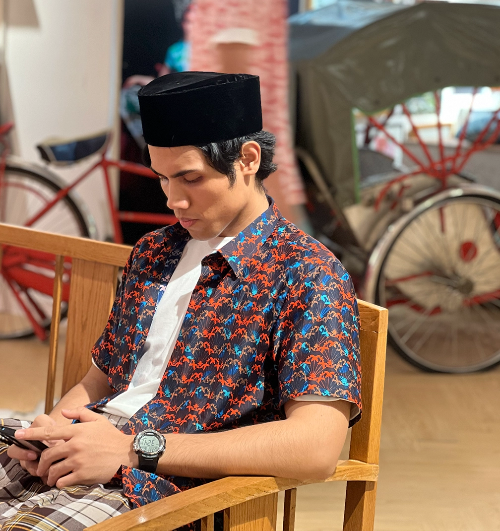
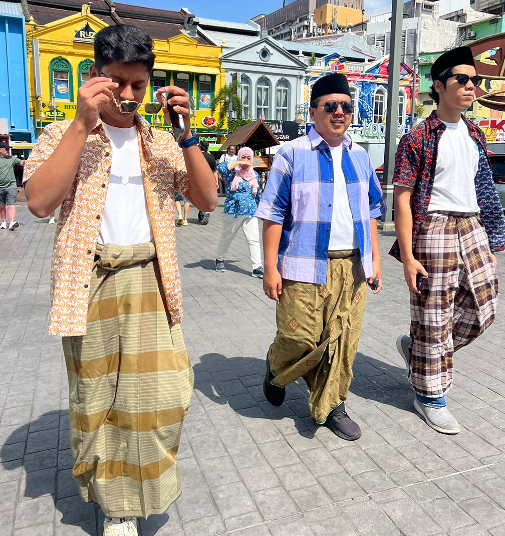
Some research happens in boardrooms.
We prefer the street.
LISETTE
SHARE
SUBSCRIBE
LOGIN
SHOP NOW
![]()

5 min read
LISETTE
SHARE
5 min read
LISETTE
SHARE
This season was a joyful one, and many of our Cheongsams have already found their way into new wardrobes. A small number are still available in stores, waiting for their moment.
5 min read
LISETTE
SHARE
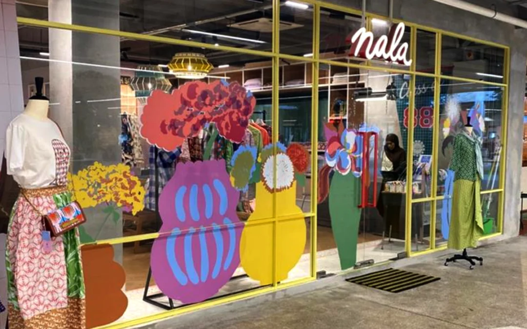
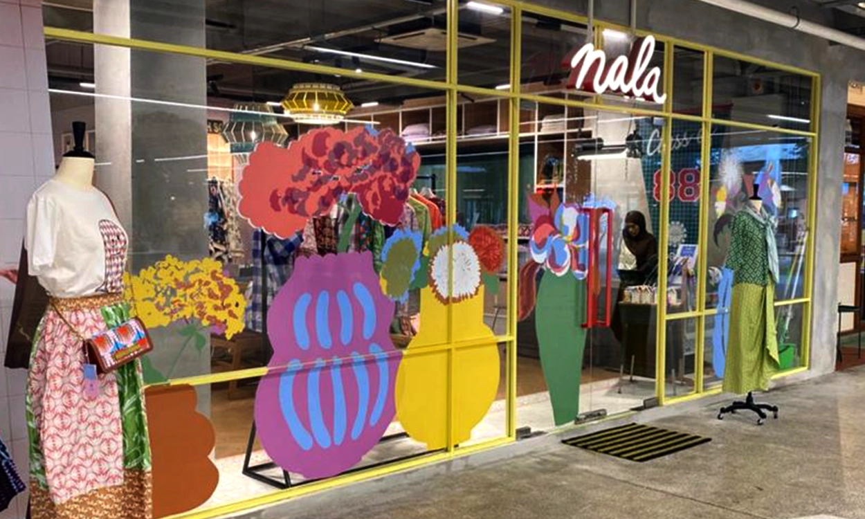
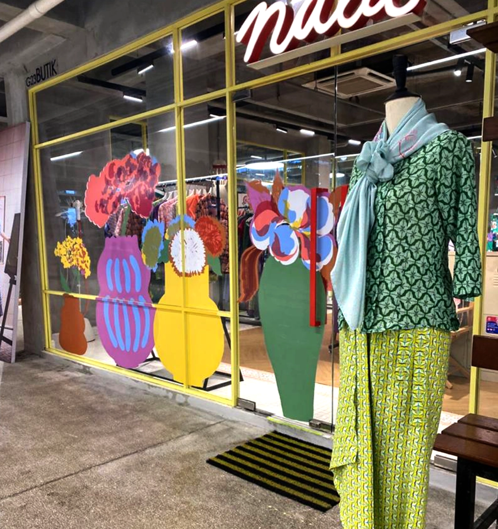
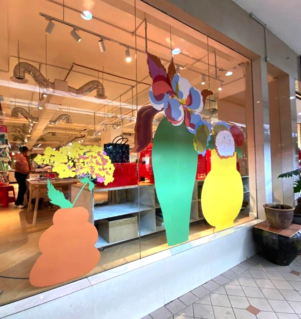
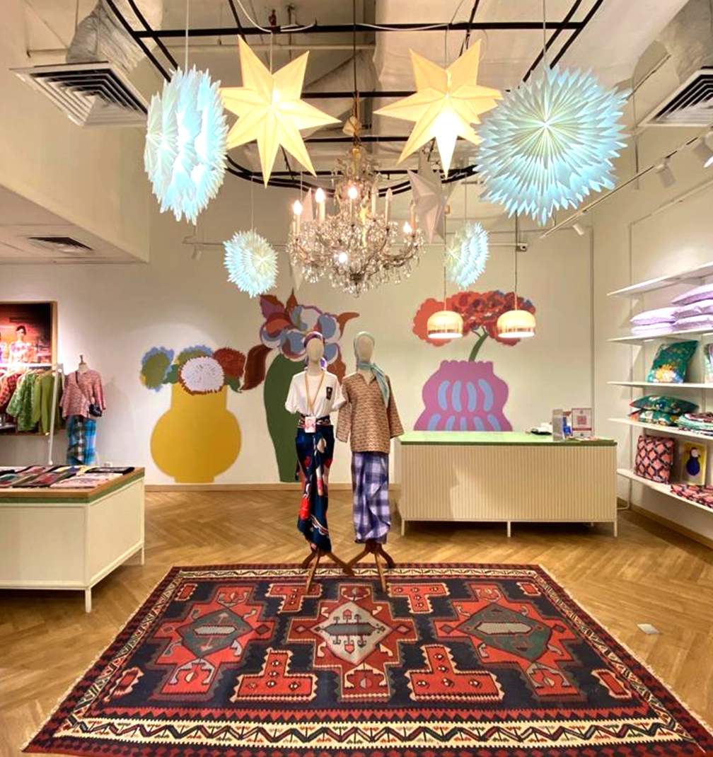
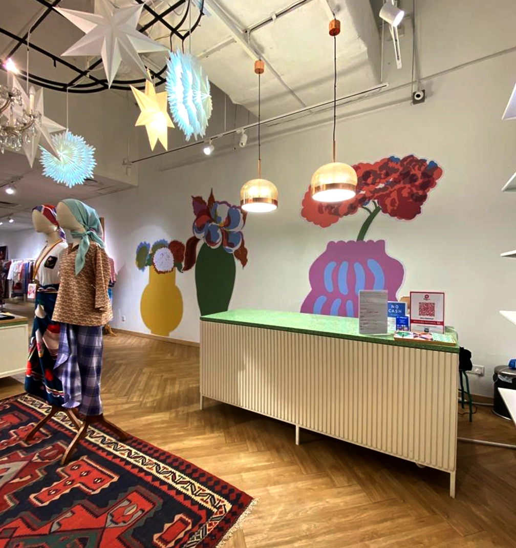
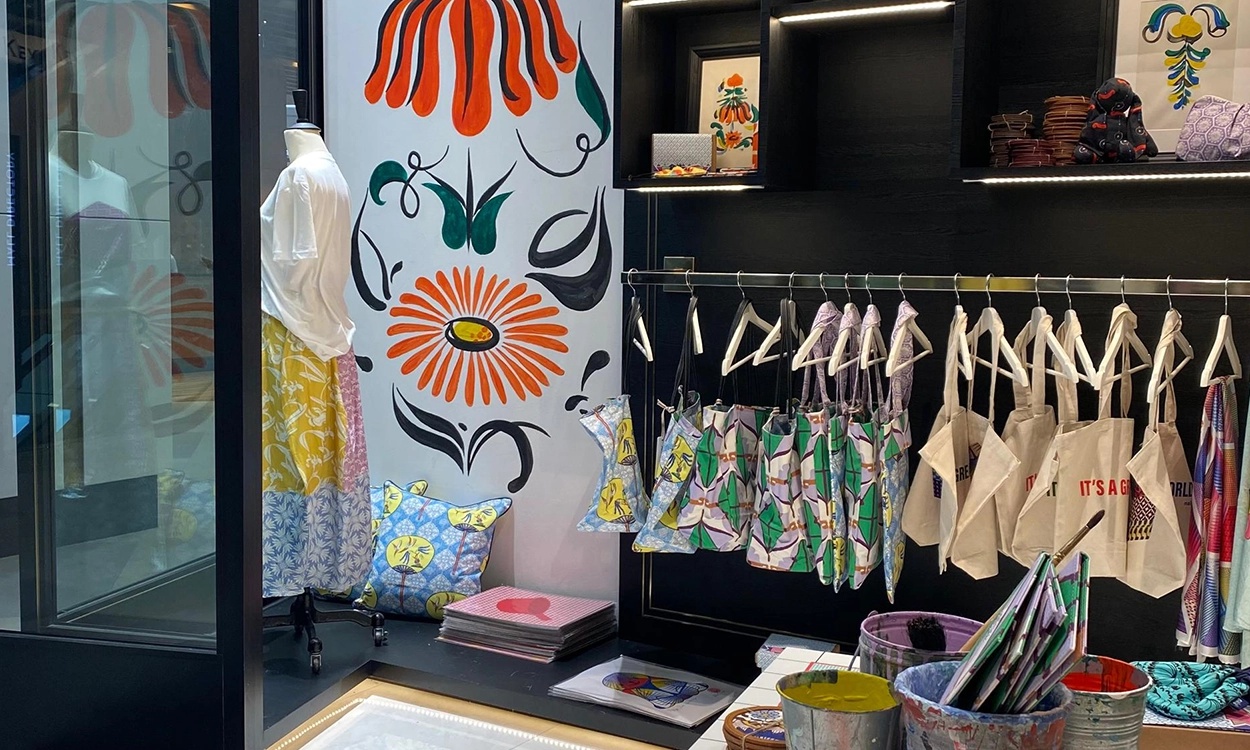
We are already present at Tanglin and at TANGS. This new address strengthens our presence in the city and allows us to explore a different rhythm and audience. The space will run for three months, during which we will introduce new work and continue shaping NALA’s Singapore story with focus and intention.
To mark the opening, we are launching two new square scarves.
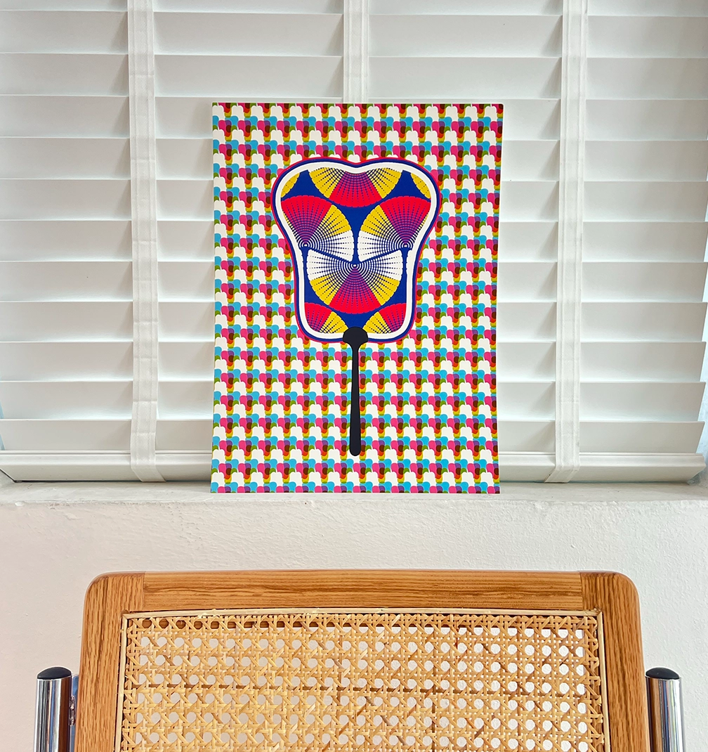
The first is the Firecracker Kuih scarf.
Kuih is an iconic Peranakan dessert loved across Singapore and Malaysia. Its sculptural form is instantly recognisable. For us, it becomes more than a cultural reference. It becomes a framework. The print is built around the elements we believe are essential for success: love, represented by a heart; grounding and substance, represented by a bean; precision and decisiveness, represented by a sharp blade; light; energy; courage. Each symbol reflects qualities required to build something meaningful and enduring.
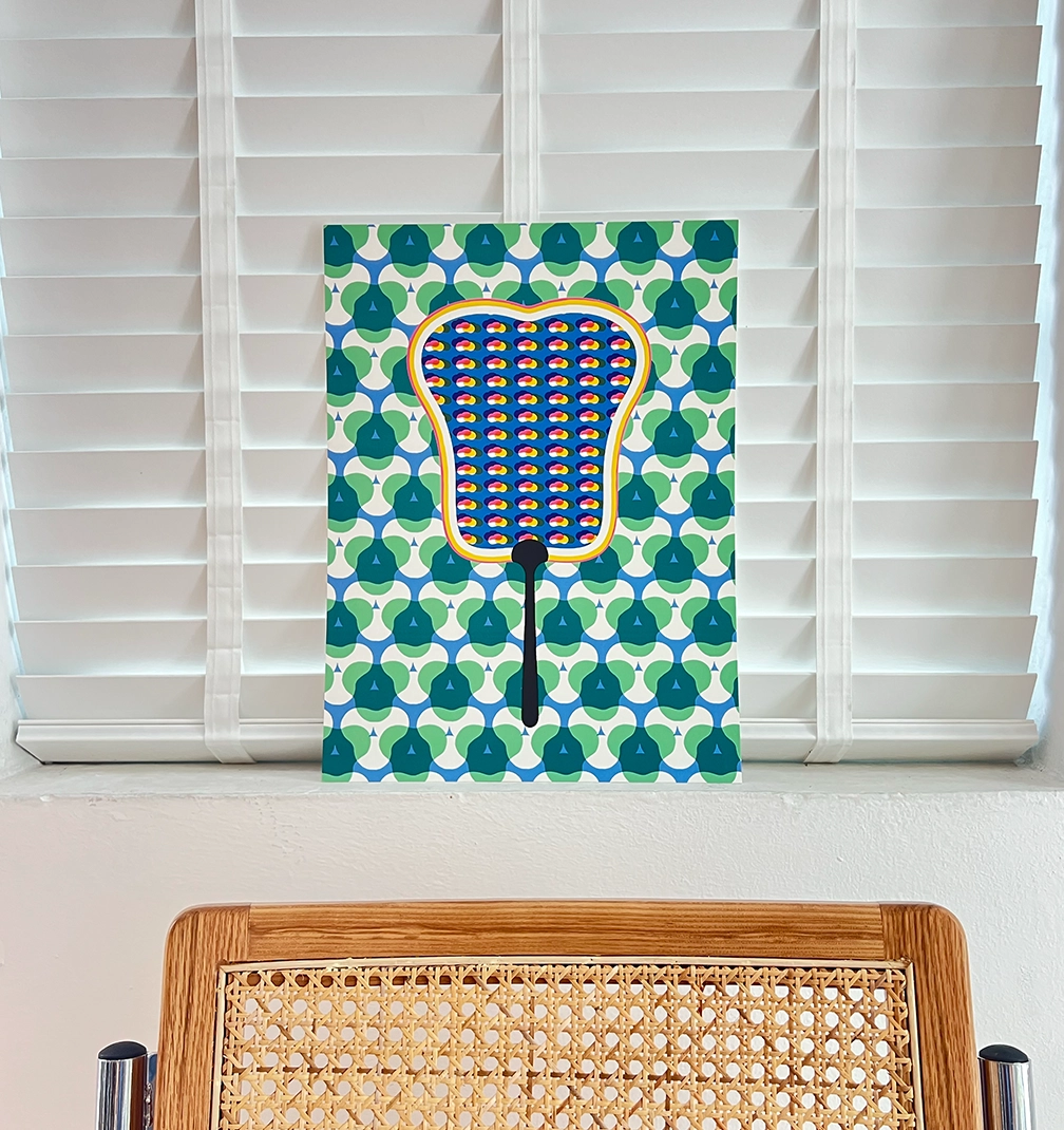
This scarf will also be accompanied by a corresponding art piece, reinforcing our belief that our prints sit within a broader design philosophy.
The second launch is a square scarf inspired by Georgia O’Keeffe and our dandelion logo. The dandelion has always symbolised resilience within NALA. O’Keeffe’s work reminds us of strength through clarity and scale. This scarf brings those ideas together, balancing delicacy with presence.
Both scarves reflect where we are as a brand today. Structured. Intentional. Confident in our voice.
We would be delighted to welcome you.
3 March
10 a.m.
Great World, Singapore
We continue to design our universe carefully, one space and one print at a time.
5 min read
LISETTE
SHARE
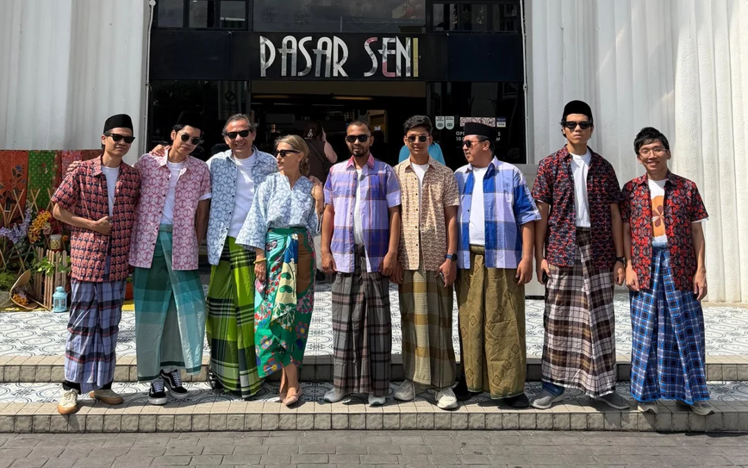
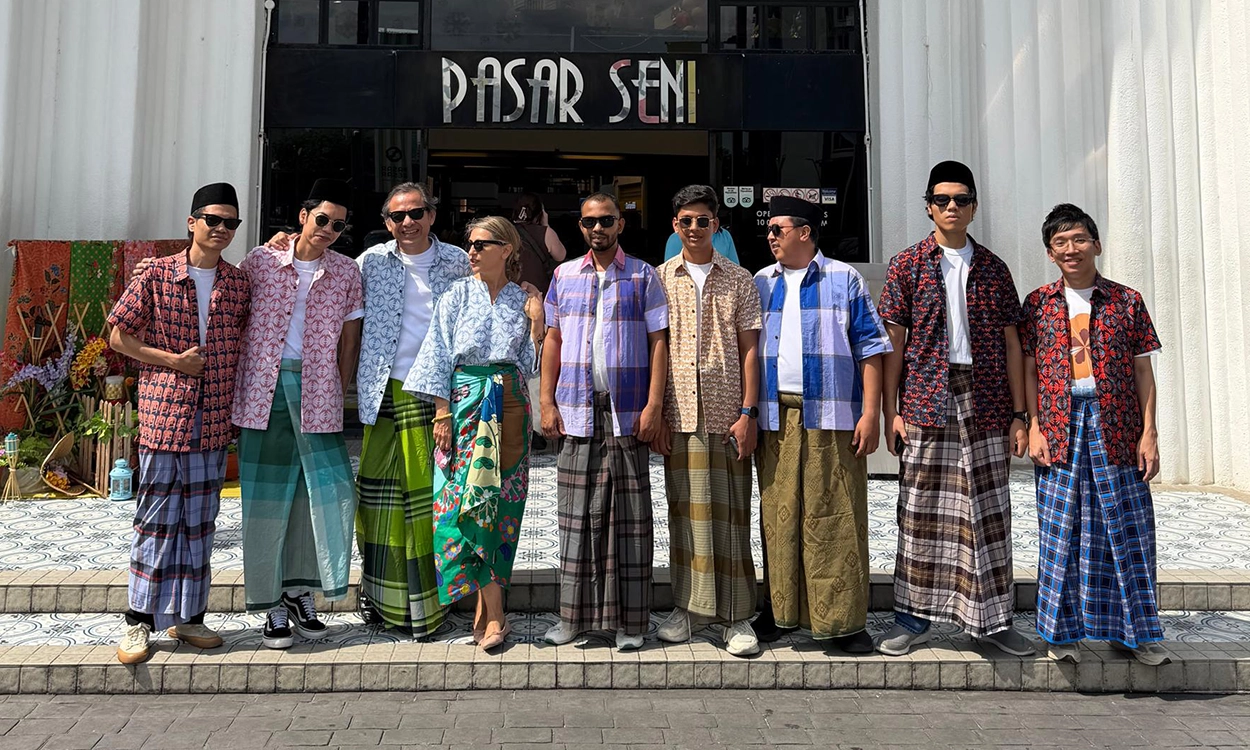
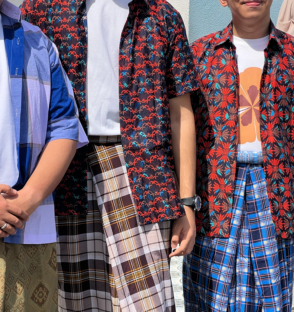
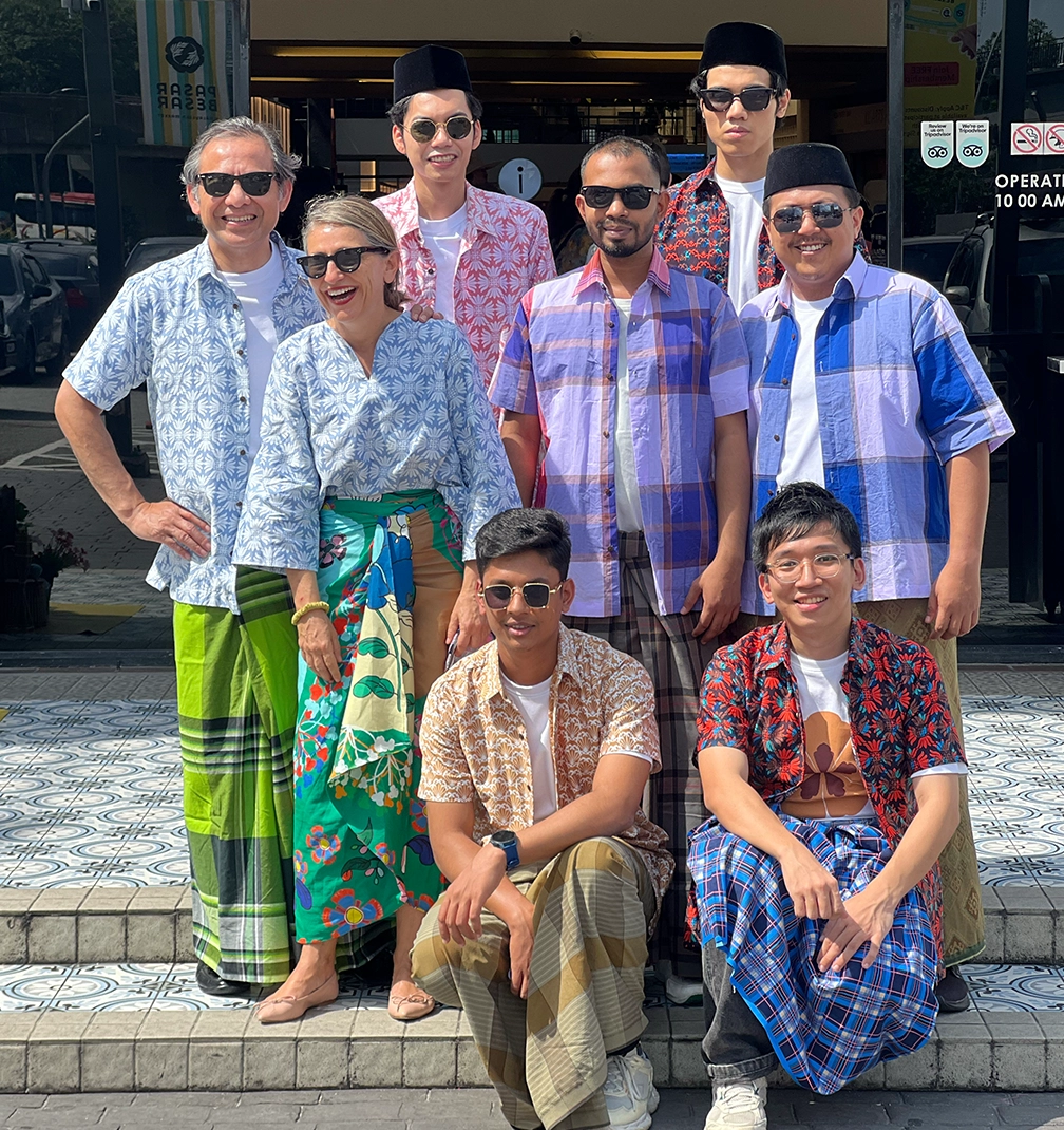
This is Raya in real life. Worn in the market, among fruit, flowers and movement, the collection feels completely at home in the everyday. You can wear it to the bazaar, to open houses, to lunch with friends, and then again on an ordinary Tuesday with a pair of jeans. It is designed to move between occasions effortlessly, without ever feeling like it belongs to just one moment.
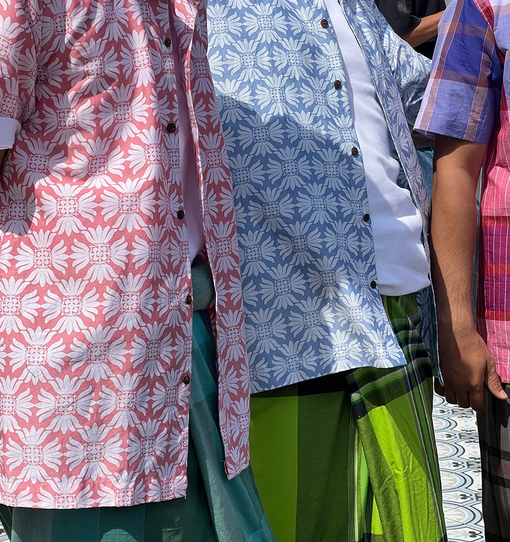
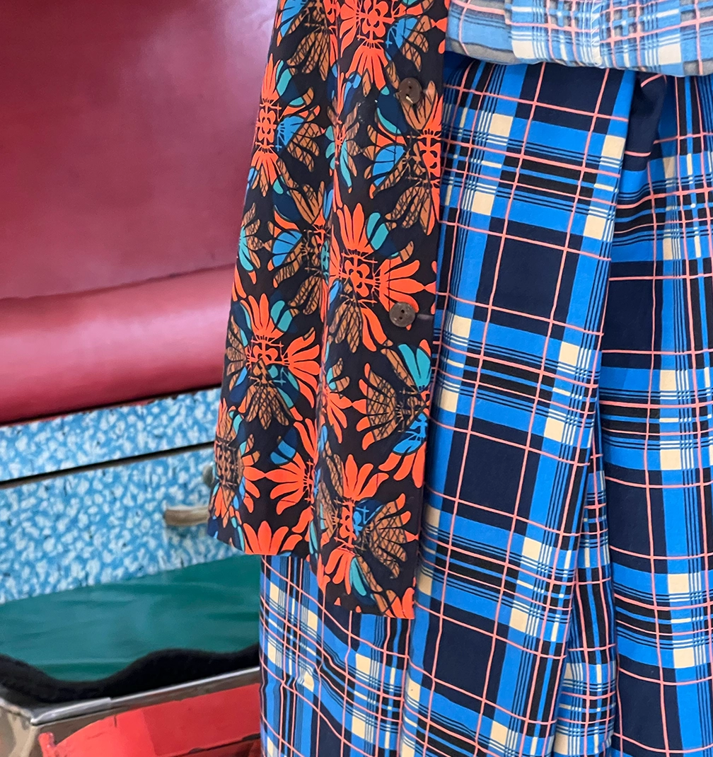
Inspired by our native Ixora, Iris and Passiflora, The Daily Bloom was printed in Malaysia using the traditional batik technique. I made this print at the very last minute because I wanted a collection that felt honest, rooted and timeless. Batik has that ability. The more you wear it, the more it becomes yours. It softens, it settles, it carries memory.
Alongside the new batik, we are also releasing a small selection of our classic NALA prints as sarongs, pieces many of you already love, now reimagined for Raya. And for the very first time, we are introducing the batik with the red chair, a print I have kept close to my heart until now.
All pieces are produced in cotton voile and cotton satin. The voile is light, breathable and effortless, perfect for our weather and for layering. The satin has a gentle structure and polish, allowing you to dress it up beautifully for evenings and open houses.
This launch is extremely limited and available exclusively this Saturday at our Kasturi branch. Once it is gone, it is truly gone.
I wanted to create something that makes sense in the way we actually live, especially during Raya when we often invest in outfits that are worn once and then forgotten. This is different. This is something you can dress up with heels and jewellery, or dress down with denim and sandals. It is something you will reach for again and again, and perhaps one day hand down.
We believe women should feel comfortable and beautiful all the time, not only on special occasions. We make our universe beautiful in the way we dress, and in the way we live.
Pasar Raya is Raya. Open, practical and alive.
5 min read
LISETTE
SHARE
Opening it felt like meeting my younger self.
This was completely pre computer era. The typography was handwritten. Layouts were drawn by hand. Text was applied manually or prepared for silkscreen. We were only just beginning to hear about computers, but they were not part of our daily practice at school. Everything required patience. Precision. Touch.
You can see it in the pages. The lines are not perfect, but they are intentional. The spacing is considered. The letters carry personality because they were shaped slowly, by hand.
I had just left Malaysia, so naturally that was the theme closest to my heart. Distance has a way of sharpening memory. The tropical references, the textures, the cultural elements, they appear instinctively throughout the work. When you are far from home, you draw home.
One project featured an Aikido school. Another was a packaging assignment for fish. Of course I chose ikan bilis. It has always been my favourite fish, so even in Antwerp, thousands of kilometres away, that small anchovy made its way into my design brief.
Looking back at these pages now, almost three decades later, I see the beginning of everything. The love for typography. The fascination with culture. The instinct to connect story and design. The discipline of working by hand.
It is humbling and comforting at the same time. A reminder that the foundation was always there. Long before Nala. Long before stores. Long before social media.
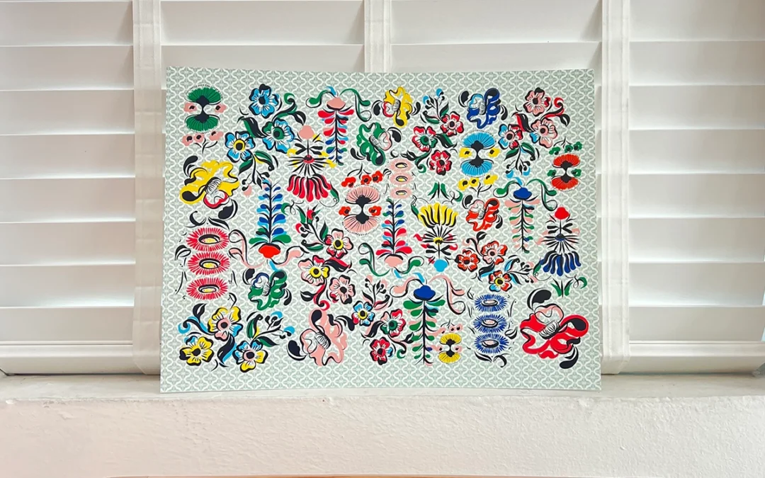
Just paper. Ink. Ideas. And a girl far from home, drawing her way forward.
5 min read
LISETTE
SHARE
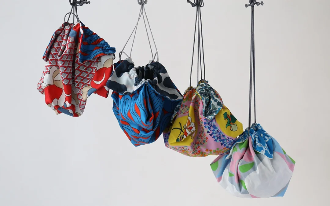
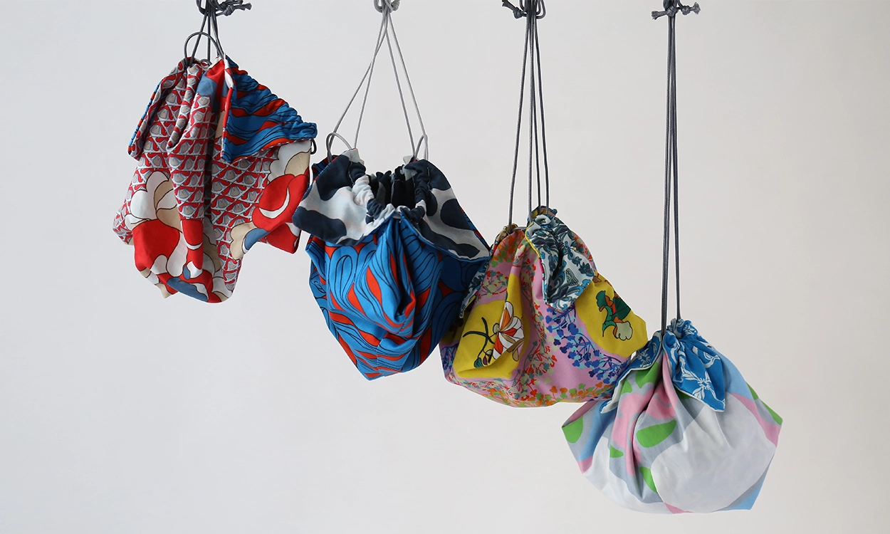
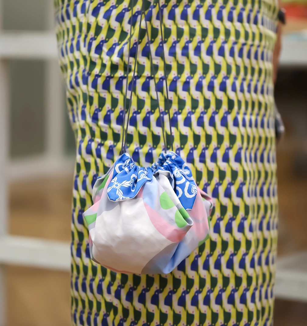
The word kinchaku simply refers to a drawstring pouch, yet culturally it carries more than function. It represents portability, intention, and the Japanese appreciation for objects that are both useful and poetic. Something small. Something personal. Something held close.
Our version honours that history while giving it a new silhouette. We crafted these kinchaku with leather handles, elevating the traditional pouch into something that can be carried effortlessly today. The form remains soft and sculptural, but the detailing makes it contemporary and strong.
And inside each bag, there is something extra special.
A 10 cent coin.
In Japan, placing a coin inside a pouch or wallet has long symbolised prosperity and good fortune. It is a small gesture, but one filled with meaning. A wish for abundance. A quiet blessing for the person who carries it. We loved the idea of sending each kinchaku into the world already carrying luck within it.
These pieces are also deeply personal to us. They are made using our archive fabrics, stock we have protected and waited to use for six or seven years. I always knew these prints deserved the right form. The right moment. The kinchaku was that moment.
There are around twenty designs in total, each one limited. Once they are gone, they are gone. Every pouch carries its own story through the fabric, layered with time and memory.
Each kinchaku may be modest in scale, but it carries layers of meaning. History from the Edo period. Archive fabrics we have guarded for years. A small coin tucked inside as a quiet wish for prosperity. It is the kind of piece that feels intimate when you hold it, as though it already has a story before you even begin your own.