


Taste
12 December 2025
5 min read
Colour. if only more people saw it
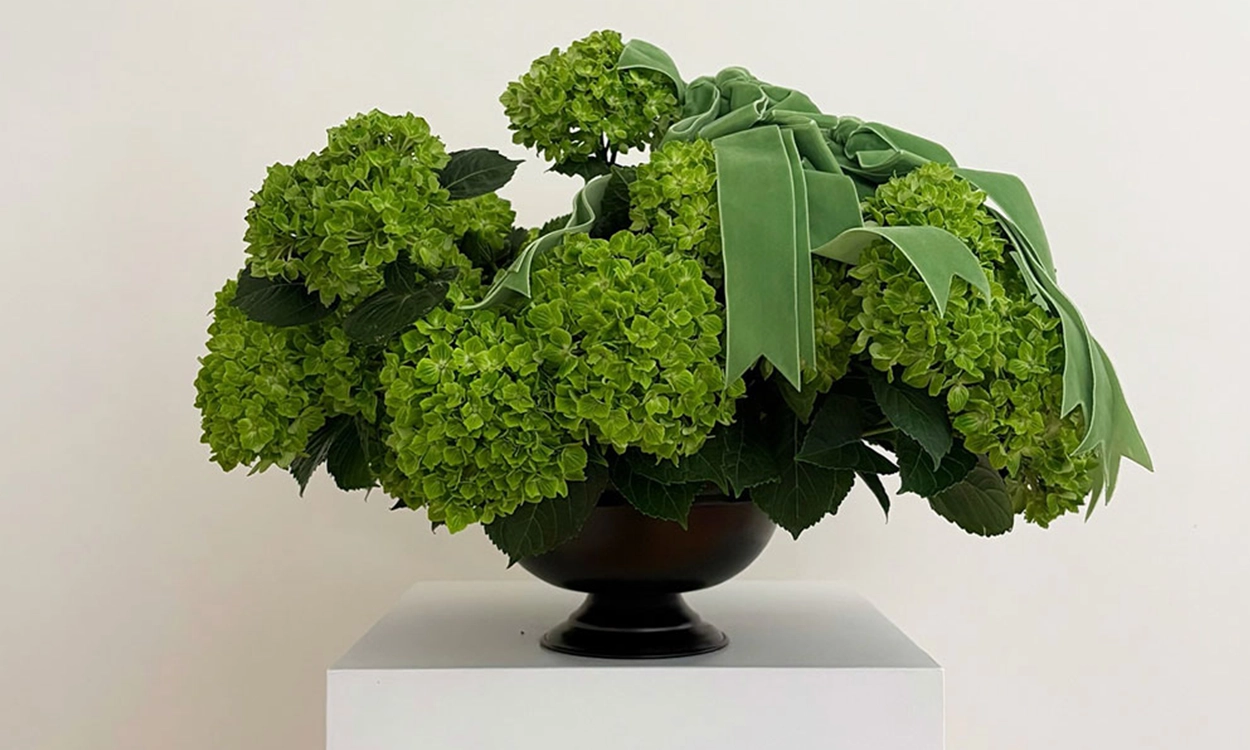
What I love about her work is her mastery of colour. Lisa Cooper is based in Sydney and her eye is extraordinary. Matching a ribbon to a flower sounds simple, but it is almost impossible to get it perfect.
LISETTE
SHARE
![]()
When she does it, it is because she truly sees colour. I relate to that. People underestimate how much time goes into choosing a shade that looks effortless. In my world it is the same. Every collection is interchangeable because I design around very specific tones. Red can be beautiful, but the wrong red can be unforgiving. Most people make colours look muddy because they do not understand how colours are built. You need to know how RGB behaves, how CMYK behaves, how silkscreen overlays work, and how digital printing shifts the hue the moment black creeps in. Even the screen will lie. If you do not know exactly what you want, the computer will never give you the
right colour.
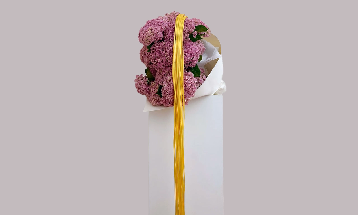
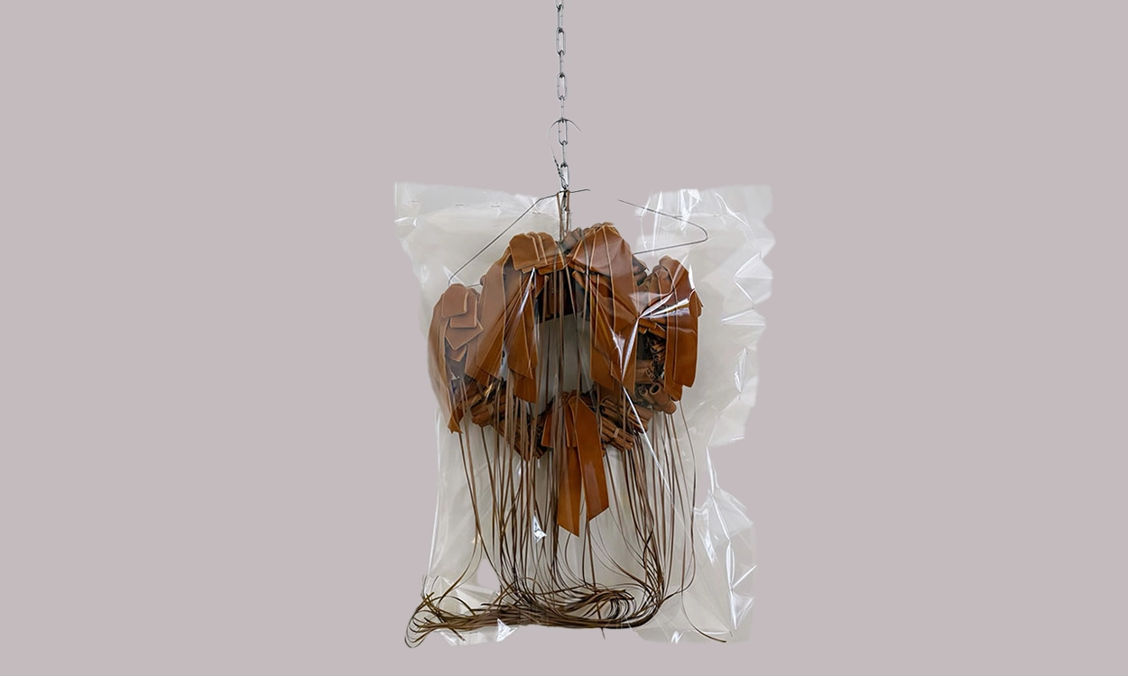
Her photography is beautiful, her sculptures are inspiring, and her entire account is a reminder that the world is full of people doing things with care and intention. I hope to visit her shop one day or even meet her. I usually feature things from closer to home, but once in a while it feels right to share someone else’s universe. Sharing is caring, and thank God for Instagram for giving us access to so much
beauty.